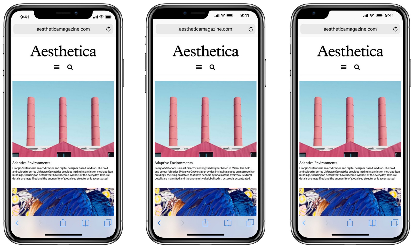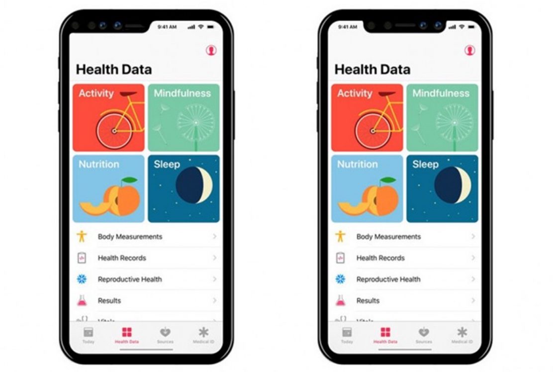
This is just a quick reaction to what the iPhone X should have looked like. In the center is what I would have designed it to look like, and on the left is what it actually looks like (just in case you didn’t know by now).
The space for front facing hardware is identical, and the screen real estate is the same. The difference is psychological. The left design feels like a square screen with a little extra, the right feels like a square screen with a chunk missing. Same hardware, but at least to my eye a far more elegant design.
The far right is a mockup of the way it could have look if Apple placed the phone earpiece on the back. It’s actually pretty intuitive and comfortable to quickly rotate the device in your hand when you need to speak on the phone. Since most people hardly use these devices to actually talk on the phone, it’s a fair tradeoff.
